Artist Vincent Longo was born in Manhattan in 1923 and his formative years seem like a novel that's part Dickens and part Umberto Eco. His higher education began at Cooper Union and he went on to the Brooklyn Museum Art School, where he studied briefly with Max Beckman.
A self-described “second wave” abstractionist, Longo was a regular at the Eighth Street Club and the Cedar Tavern, where he shared in the talking and drinking that took place with some of America’s most revered Abstraction Expressionists.
From 1957 he taught in the legendary Bennington College art department, later returning to New York City to teach full time at Hunter College, where he remained until his retirement in 2001. An acclaimed painter, printmaker and educator, Vincent Longo works every day in his Amagansett studio in The Hamptons.
.
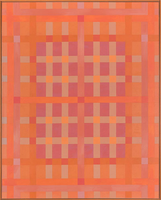
"Lattice: Center Dark" by Vincent Longo, 2008. Acrylic on canvas, 60 x 48 inches.
.
Vincent Longo was interviewed by Janet Goleas at The Drawing Room Gallery in East Hampton, N.Y. on the occasion of Longo’s 2015 exhibition there.
Janet Goleas: Welcome, Mr. Longo.
Vincent Longo: It’s good to be here.
JG: One of the conversations I’ve had over and over with people that come into the gallery is the degree of improvisation in your work within this field of systemic, organized form. Can you talk a little bit about your process?
VL: It's all predicated on a statement that Picasso made many years ago. He said “I don't seek, I find.” I start with one thing and it leads to another. That's it. It keeps going until either I see something happening or not, and decide what to do. My overall intentions—what I hope the results turn out to be—is that whatever seems like a finished product, I want that to have a kind of particular action with the viewer that puts the viewer in affect. If I'm successful, the viewer is accepting automatically what is going on in the front, in terms of the meaning. That person has more chance of seeing what might be happening.
JG: You’ve said on occasion that you start not with a gridded surface, but that you turn the surface into a rectangle to find the image. Like Michelangelo, you’re seeking to find an image that’s already there.
.
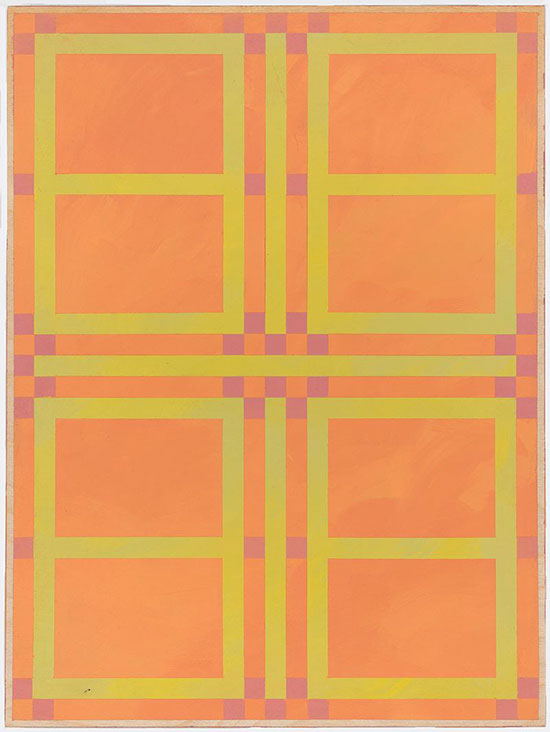
"Casement" by Vincent Longo, 2006. Acrylic on wood, 12 x 9 inches.
.
VL: I always start with a vertical in the middle and I cross that with horizontal. That creates a center point. The ultimate aim is to make what seems to be the center area relate in some way or connect with the format itself. In a lot of the earlier grids, after doing that, which creates four quadrants, I then located the center again with diagonals and just kept going—first the vertical, then the horizontal, then diagonal. Eventually I had a grid. Once I got that, I tried to convey the distinction between what is a grid and what is a screen—what is the tone, what is the line, what is the weave—and I would play with those things visually. I'm not planning anything. I just let it go. In a lot of the prints that I've done that way, while I'm making all of these lines, repeating each other, I leave some blank. That's arbitrary as well because I can't really see through the heavy ground just what the result is until I take the ground off. Then I can see if it worked out.
.
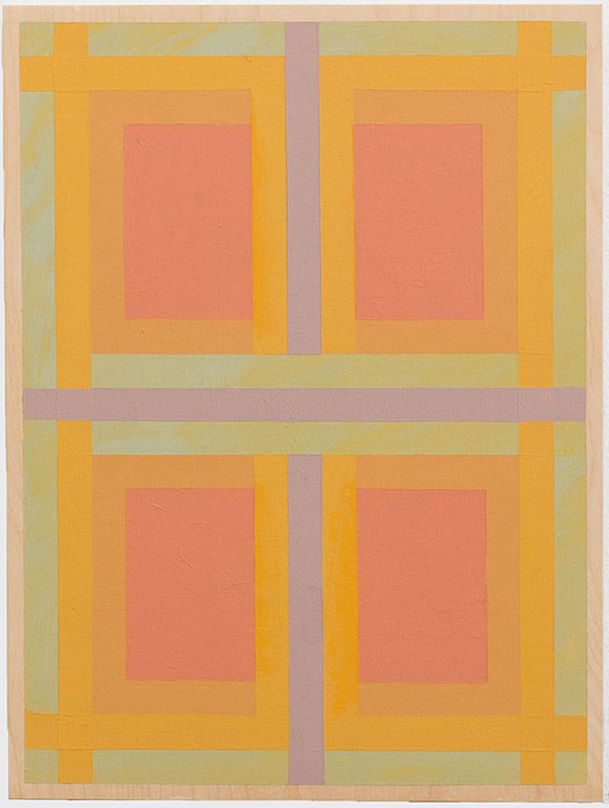
"Cover" by Vincent Longo, 2006. Acrylic on wood, 9 x 12 inches.
.
JG: So what might look like a mathematical equation or some synthesis of rectangle next to rectangle possesses a structural logic that often becomes a greater and greater visual conundrum. Can you talk about that?
VL: It is mainly two grids placed over the other, overlapped. That's a hangover from my Cubist start. I started abstraction through Cubism at Cooper Union and what it creates is an overlapping space. Cubism accepted flatness, but I wanted to make a metaphor of the things that you don't see in the materials. The things that we step on, live in, are not really solid. It's like a universe of space; it was mainly a metaphor for that kind of non-existence. A lot of this has to do with ... let me just wander a little bit from the center. In 1948, a group of artists in New York formed what they called the School of the Subjects of the Artist. It was on 8th street, right around the corner from the Cedar Bar.
JG: That became The Club.
VL: That became The Club. What they wanted to do was, they called up the subjects of the artist and then we had to find that. What is the subject? A word came to be used. I never used it at that time. Jose Ortega y Gasset was a philosopher of art and he used the word intra-subjectiveness. Their subject had to be something coming from deep inside the person. I heard about this word many years later; at that time the word I was using myself was inwardness or inbeing. I was trying to connote what the actual essence of art is. In this case, painting—and that's not too easy to do—but we all try doing it.
JG: You have a great quote that you mentioned in one of your interviews. It pertained to your travels to Italy on a Fulbright, your first grant. You saw works by Piero della Francesca and of course many other historical Italian artists and it caused you, when you came back to the United States, to reconsider Pollock and to look at his work in terms of a structure that he imposed on it. Let me read this quote:
“Pollock offered a new visual language. For him, painting was no longer a picture of something. It was a painting itself. The act of painting became a way of finding the self.”
You’ve talked a lot about symbolism and origins of imagery. Can you connect those two ideas for us?
VL: Just to stretch that a bit. Finding the essence of painting meant finding the essence of life itself, matter itself, everything. Thomas Aquinas once said that existence is “the act of essence,” so existence is not a noun, it's a verb. It has to do with action so it's an act of essence. I think that expression, maybe not literally, was what guided the whole group. They all found different ways of working.
JG: These are the first tier Abstract Expressionists…
VL: The first generation. Yes. Rosalind Krauss refers to it as the second wave. The first wave happened around 1910: Cezanne, Klee, Kupka, Kandinsky, Picasso; everybody looked at those people. Krauss called it the first wave. The second wave was New York, and New York was predicated on this acting out. The act became as important as the painting itself. And I think the impetus was to dismiss French taste and so it became referred to as the New York School or New York painting. Then Rosenberg referred to this as “Action Painting” and someone else called it Abstract Expressionism. Both of them are misnomers. All of these artists painted differently. It wasn't a style.
JG: Absolutely.
VL: It was all abstract. It was all the way people found it.
JG: Of the many fascinating things you’ve said, you’ve mentioned that when you first went to Cooper Union there was no such thing as abstraction. It's not like there was a “school of abstraction.” Abstraction was in the throes of erupting and would take hold after World War II.
VL: A book came out around the same time called “Abstraction and Empathy.” It had a big effect on a lot of people. It was written by Wilhelm Worringer, Swiss. He wrote it for his doctoral thesis. By “abstraction and empathy” he meant that empathy projected self-love in its surroundings, and that would result in realistic art. Abstraction was the reverse of that. It's agoraphobic. It was the fear of open spaces. It had mainly to do with total inwardness.
JG: So realism was the gregarious older brother and abstraction was the intellectual-in-hiding, the younger sister.
VL: The aesthetic dilemma that Worringer faced was that there was no such thing as abstract painting, so he found abstraction in ornament. Mainly, there were traces of it in Paleolithic art but it had a flowering in the Neolithic—late stone age, early iron age—art that emphasized ornament. All of it was totally abstract. Even when they created natural things like leaves and flowers they weren't trying to draw realistically. They were trying to draw the structure of it. It was all about building abstract structure. It's mathematical at its heart, without counting and all that.
JG: And you saw a lot that work firsthand. The 1950s?
VL: Yes. I was at Yaddo in 1954 and we found a book in the library in French, written by a minor cubist that showed all of the prehistoric cave paintings. Several books interested me at that time. There’s a great book by Gertrude Rachel Levy, an anthropologist, called “The Gate of Horn.” She investigated early temple building and pointed out places like the Newgrange passage tombs. All of these places had very powerful abstract designs on them. What they meant? No one knows. I became very interested in that. It affected the way my work went.
JG: You saw those firsthand in various places.
VL: In three different places. During my Fulbright to Italy, kind of on the way home, we stopped at Newgrange and saw the tomb that was there which is very important. As a doorway design they had this spiral in relief.
JG: Amazing.
VL: Some also had mandala-type designs with the square and the circle at the center. That was part of the whole universal thing of certain signs representing maybe psychic wholeness or whatever. We don't know exactly what they meant.
.
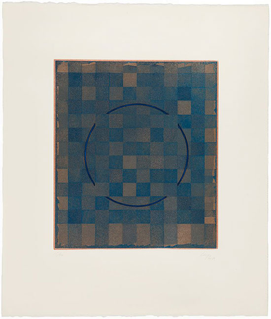
"Untitled" by Vincent Longo, 1976-1980. Etching, 13 1/2 x 11 3/4 inches image, 24 x 20 1/2 inches framed. Ed. 15/20.
.
JG: Did you already have this concept when you embarked on that trip?
VL: My earliest work had to do with centers but once I got involved with New York painting, I got more into using linear motifs.
JG: Do you think that was an aspect of working in printmaking?
VL: It had something to do with it because my grids really come out of crosshatching, which was the only way in etching or engraving you could get shape or shading. Intaglio means a line cut in and filled with ink and pressed out with damp paper and pressure. The only way you could create it in beginning an area was to make a lot of lines. Those things got into my painting gradually.
.
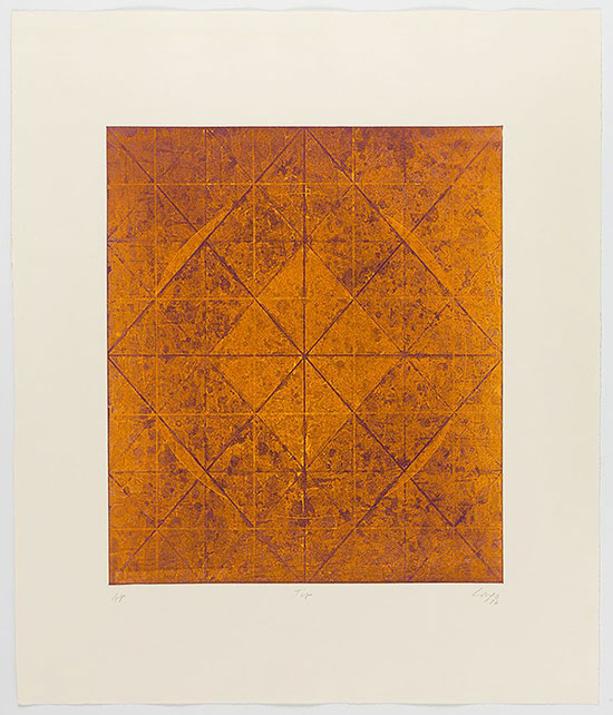
"Tip" by Vincent Longo, 1976. Etching, 15 3/4 x 13 1/2 inches image, 24 1/8 x 20 1/8 inches paper. Ed. AP.
.
JG: One of the other things that so many people have talked about when they come into this show is how your work changes given the lighting circumstances. If the sun is out, they have you apprehended in one way and if it's raining out there, a little bit different. When I heard about you visiting the Piero della Francescas in Italy I thought immediately of that idea. Most of these paintings are viewed under tungsten lighting .
VL: I think the painting that affected me most ... I saw three different things. I went to see Piero della Francesca’s The History of the True Cross. That's the most important one. Then he did The Flagellation which is in Urbino and that's only a painting this size [holds his hands apart] but it’s incredible. You see it in a book and you think it's a huge painting; it has got great scale in it. But the painting that affected me the most is The Resurrection, the painting of Jesus coming out of the tomb. That's a huge painting and it's probably the most powerful painting that I've ever seen in realism. It's just so majestic it wipes you out.
JG: A lot of medieval and quattrocento painters used gold leaf in an attempt to find a majestic color.
VL: It worked for Fra Angelico a lot.
JG: I think for some people, myself certainly, your paintings flicker in front of my eyes as if they are gold leaf, or as if there is some illusion of light passing over.
.

"Lattice: Yellow Light 2" by Vincent Longo, 2010. Acrylic on wood, 20 x 16 inches.
.
VL: I consciously try to make the paint take the place of light because color is light. The only way you can do that is to learn how colors relate to one another. Color is a totally relative factor. By itself it doesn't mean anything much except you can name it orange or red, but it's important to know what happens if you put such and such next to it. You can only learn that by doing it. You learn a little bit by theory. You learn about simultaneous contrast and the fact that complementary colors fortify each other, that green makes red look redder and that even adjacent colors tend to move apart because you're already looking at one color and get immediately exhausted with that color and it calls out the opposite.
What led me to this use of color are two things. One, I learned about cell systems in high school; I was very lucky that a woman gave a lecture in our auditorium and she held a light bulb and lit it. She put all the lights out and had us stare into the light bulb and close our eyes afterward. She began telling us what was happening in the aftereffects. When you closed your eyes the color changed and eventually disappeared. That sort of phenomenon has to do with the way simultaneous contrast works, because the eye gets tired and sees the opposite. More importantly, many years later I came upon a book by a psychologist, David Katz. He wrote a book called “The World of Color.” He experimented with trying to find the difference between what are reflected colors, the colors that we see every day around us, and film color.
Film color refers to colors that have no surface, or an indeterminate surface. Or that has a spongy quality. The best example of that is on a clear day like today, look up at the sky and you'll see pure blue, but it has no surface.
.
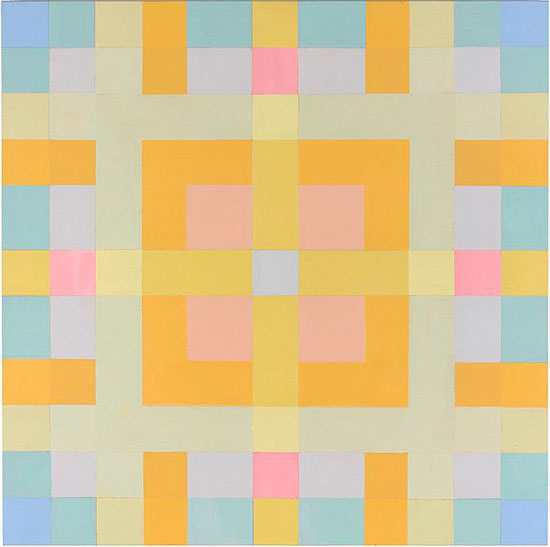
"Gold Rim" by Vincent Longo, 2006. Acrylic on wood, 18 x 18 inches.
.
JG: Fascinating.
VL: The same thing happens even on a cloudy day. If the clouds are all even and you don't see variants, that becomes grey. He also dealt with color in a way that I became very interested in: the color phenomenon that's internal; the color that you see behind closed eyelids. That's what you call “subjective visual grey.” That's also another kind of film because you don't see a surface. You just see some ... you see anything. Depends on what are you just looking at or if it's dark or light.
JG: What a beautiful concept.
VL: I’ve tried to use that as a model. You can't do it. I think about it.
JG: We were talking about Jackson Pollock and some people would say that he atomized the picture plane, fracturing it into a million different parts. Some of your paintings also atomize the picture plane but in a more systematic way. You’ve talked about Tony Smith as being a big influence on you, not only as a great friend but because of his “modular invention,” I think you said. That took my breath away. What a brilliant connection between your work and sculpture. Can you talk a little bit about it?
.
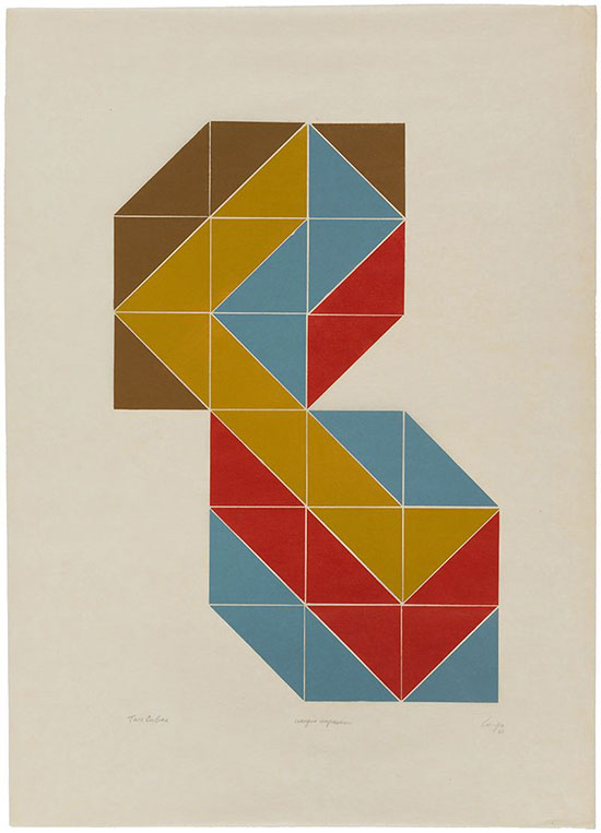
"Two Cubes (Unique Impression)" by Vincent Longo, 1968. Woodcut, 34 1/8 x 24 3/8 inches paper, 36 3/4 x 27 1/4 inches framed. Ed. unique.
.
VL: Tony could be pretty nasty. He had a very acerbic sense of humor. He’d look at Albers and say the trouble was that he’d have to look. He thought you should be able to take in a painting at a glance. It really had to grab you. The other thing he said about Albers was that he used three colors. That he wasn’t good enough to use two colors—that he was cheating.
JG: It was just cheating!
VL: He came to my studio once and he looked at my painting, the one I happened to be doing, and he said “Albers and Rothko.” That combination. But I got a lot out of Tony. He was a very brilliant man. He could recite a whole chapter of Finnegan’s Wake totally drunk. Kate and I used to have to drag him into a restaurant to eat.
JG: Because he was a little tipsy?
VL: Totally.
JG: You guys had fun at Bennington.
VL: Tony was a very good friend of Pollock. His closest friends were Pollock, Rothko and Barnett Newman.
JG: In a life lived well and long, what changes in your studio or in your approach to painting?
VL: I think my painting has been fairly consistent, even though there have been changes. In fact, I still see the traces of the Abstract Expression in my woodcuts which are very gestural even though they are grids. But my earliest interest, in my painting, always had to do with the center. I don't know why.
.
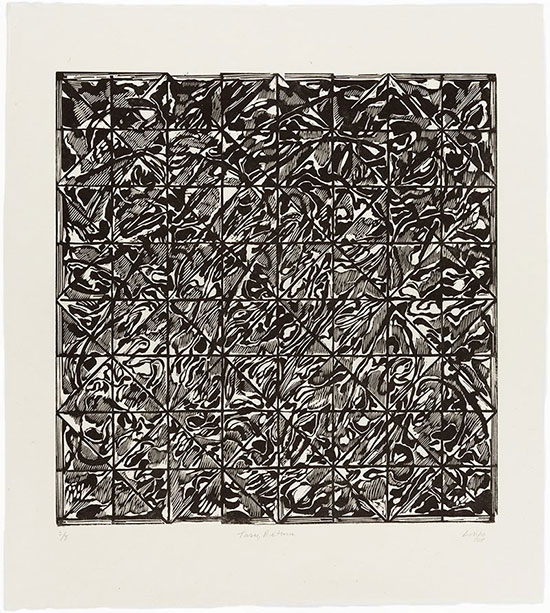
"Turn, Return" by Vincent Longo, 2005. Woodcut, 18 1/4 x 17 7/8 inches image, 25 3/4 x 23 1/4 inches framed. Ed. 2/8.
.
JG: Thank you , Vincent. Are there any questions from our audience?
Audience 1: I have a question. I'm not that versed in art history but my question is with respect to your comment about Pollock, having said that his process was about action and to me that seems to disguise him as a solopsistic character. That means to me that he is not really interested in the viewer but only in his own process. Having said that, I was wondering whether that would be true of your process, what you talk about in terms of finding your way.
VL: I think everybody tends to do that.
Audience 1: Only in modern art or overall?
VL : Overall. I don't think the act of painting is changed in that sense at all. Ever.
Audience 1: I say in relation to the representational in painting. There the viewer can easily relate to what’s going on whereas in abstraction…
VL : When people say this to me I really would like them to look a lot longer at what they call “representational painting” and you’ll see a lot more than what it looks like. Painting is really about creating something that hasn't existed before. That’s what we all strive to do and it's not about copying nature really. If you look at Monet, he wasn't copying nature. He was redoing it and he was celebrating it. There was a show at Gagosian few years ago of his late paintings. He left white around the canvas and that white in no way interrupted what happened inside. These are all about color. I think it’s fine to have certain preferences of subject and style and what have you, but you remind me of a woman that I encountered when I was still a kid at Cooper. I was looking at White on White by [Kazimir] Malevich at the Modern and she comes up next to me. She said, “You call that art?” or something like that. “Why are you looking at this?” I said. “If you really want to know what’s going on here, you have to take longer looks at Rembrandt.” It's all a continuum.
Audience 2: Who is your favorite student?
VL: My favorite student? There are too many of them. I've taught for 45 years. But one of them was a realistic painter. Mark Tansey. He came to Hunter to get his master’s but he was an art historian. He took my printmaking class and made an etching. He copied a Rembrandt leaving the head out. It was a stunning little print and he gave me the plate and the print. I still have it. I tried to get him to switch his major but he wouldn’t do it. He didn't have to, he was already an artist, I guess.
JG: Jack [Youngerman], do you have a question?
Youngerman: Yes. It's not an interesting question but I put up my hand. Looking at those paintings I see hardly any traces of overpainting and I can't figure out how you are able to orchestrate all those tonalities and values without having to overpaint time and again—like hundreds of times. I have no idea how you do it.
VL: Talking about Pollock, when I was 19 and was just out of high school, I worked in a printmaking shop making printing plans for the Creative Printmakers Group, an extension of the WPA. Pollock worked there, too, but he worked at night so I never really got to know him well. But he was very interested in the pick-up cards we used to clean the screens. They were all full of scratches and drips. I always imagined that was part of his influence.
While I was there, I wasn’t very good. I was very small and I couldn’t handle the big squeegees for printing, so they asked me to be their colorist. For several months I trained as a color mixer. They would hand me something like a piece of cloth and say “OK, mix that,” and I’d have to find out what kind of blue is that, how much black is there and how much red, whatever. I’d start with a jar like this [motions with hands] and then end up with a gallon or two, but I learned a lot about color just by mixing.
Audience 4: It shows.
JG: Thank you so much, Vincent, and thank you everyone.
VL: That was fun. Thank you.
.
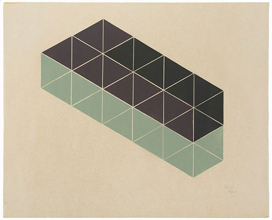
"Box III" by Vincent Longo, 1968. Woodcut, 23 1/2 x 28 1/2 inches paper, 27 7/8 x 32 3/4 inches framed. Ed. unique.
.
____________________________
Copyright 2016 Hamptons Art Hub LLC. All rights reserved.
