A visit to the stunning Michael Boyd show at Eric Firestone Gallery Loft in New York is both contemplative and joyful, created by the collective impact of these brilliantly hued abstract works. All were produced during a marvelous creative jag from 1970 through 1972.
Michael Boyd (1936-2015) earned his art degree at the University of Northern Iowa and at one point lived in Ajijic, Mexico; the solar power of some of these canvases can be related to that stint. While teaching a popular Cornell course on design “centered on ergonomics and environmental analysis” (according to a release from the gallery) he maintained a studio in a Soho loft.
His earliest paintings were in the Abstract Expressionist mode, until just about the moment when he tightened down his compositions into the geometry of the work on view. His work is in the Albright Knox, Chrysler and Everson museums. The paintings in the Firestone Loft show were first seen in a solo exhibition at the Max Hutchinson Gallery in New York. The year was 1973.
.
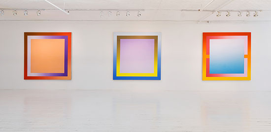
"Michael Boyd: That’s How the Light Gets In: 1970 – 1972" at Eric Firestone Loft. Courtesy of Eric Firestone Gallery.
.
One of the most magnetic works in “Michael Boyd, That’s How the Light Gets In: 1970 - 1972” is Azimuth (1972), its glowing golden core retaining an elemental purity while the delicately modulated lunar blue and lilac pulse around the periphery. A cooler approach is taken by the satin nickel border to the tangerine center of Tangible (for Verlaine), created in 1971 for the artist’s wife Verlaine (not the famous French poet, as I initially guessed). The coolest of all is Blue Place for Doof Study (1972), with a crystalline blue cube that looks like it has been carved from the interior of an iceberg.
At first I thought I had the square formula of Boyd’s compositions figured out, relying on familiarity with Josef Albers, Frank Stella and Peter Halley. Like Boyd, Albers used systematic grouping of colors whose compositional baseline was the square. The two artists offer superb examples of the gutsy exploration of color combinations that lie far beyond the predictive charts and rules of harmony or complementarity that are taught in most art schools. In addition to the perceptual play of unusual color combinations within the square, the common denominator between Albers and Boyd is their 1-2-3 structure of nested boxes, a waltz meter that telescopes or projects depending on color choices (an exception for Boyd is the binary Orchard).
Then, just when the theme seemed clear, I picked up on what the gallery calls the “gradient” aspect of Boyd’s paintings. This light-suffused gradation of color from more to less intense is what separates Boyd from Albers and many other geometric painters who keep color constant on the plane within the borders of form. The ombre as a graphic technique is no longer such a big deal.
.
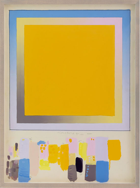
"Azimuth Study" by Michael Boyd, 1972. Acrylic and graphite on paper, 30 x 22 inches. Courtesy at Eric Firestone Gallery.
.
Nowadays anyone with a Mac can manage the fading tone with a couple of keystrokes, but Boyd managed it degree-by-degree with painterly panache. The most dramatic example in the show is Cosmos (1970), which diagonally opposes the contrast between the full-throttle green and lilac border and its ghostly echo at the top right corner.
There are two possible approaches to this show: sunbathe in the radiant pleasure of the bright tones, or buckle down to analyze the method behind the progressive array.
.
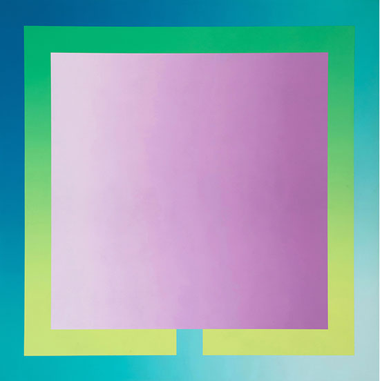
"Mosque" by Michael Boyd, 1972. Acrylic on canvas, 60 x 60 inches. Courtesy of Eric Firestone Gallery.
.
Spending as much time in contemplation of the studies as with the paintings, I was determined to enter the mindset of Boyd, deciphering the annotations (mostly notes on color names) and following the steps in the mixing of the tones that wound up on the canvas. I researched Boyd’s theories via an article on his analytic philosophy of form published in Art Journal in 1991 under the title “Structure: A Personal History.”
The works on view at Firestone were the prelude to a period when Boyd was painstakingly working out ever more intricate structures involving tricky color choices. As he wrote, “Around 1973 I began to develop a complex compositional process combining systematic and intuitive elements in a grid-based format.” It is no easy thing to move from this systematic “distribution of elements on a grid” to the kind of painting that moves viewers. After the series in this show, Boyd embarked on an even grander project in 1987 that took the plan of French Gothic cathedrals and “rationalized” a grid upon which he composed his colorful paintings. I’d love to see some of these, too.
.
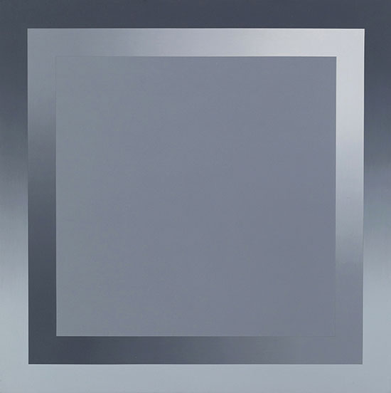
"Bridge" by Michael Boyd, 1972. Acrylic on canvas, 22 x 22 inches. Courtesy of Eric Firestone Gallery.
.
In the gallery, the way to draw close to Boyd’s mind is to compare the drawings included in the show with the paintings. Among the works on paper, the Bustelo Study (1971) reveals a great deal about the process, and has the most information about Boyd’s chromatic range. Three closely modulated versions of the Mediterranean blue and even more shades of the red are tried out in test strokes, on top of which Boyd flicks a quick dab of the complementary shade (the blue on the red is the paradigm) to set off the optical reaction, that “interaction of color” that Albers was adamant about.
.
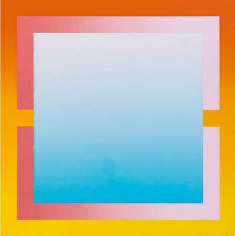
"Bustelo" by Michael Boyd, 1972. Acrylic on canvas, 78 x 78 inches. Courtesy of Eric Firestone Gallery.
.
The risk and reward are calculated in those dabs of blue on top of the red. The blue at the center slips into a powdery tone even as the yellow deepens into orange, powering its way across the black outline of the square. Comparing the study with the painting To JA, it is easy to see that he preferred the bottom of two slightly different iterations, shifting the deeper base of the green tone to the bottom left corner and letting the gradient fade upward and to the right. The experimental tinkering is irresistible, and the paintings are as illuminated by the experience of the drawings as by the gallery lights themselves.
The Boyd show prompted a fantasy seminar on color theory that would align him with Albers and Peter Halley. For all the structural similarities among their square format works, I do not think a group exhibition would succeed, but a debate on the topic would be superb. Halley uses pulsing neon and DayGlo “cells” to blast as much color into the square as it can hold. Power is the key. As he has written: “In the planar universe, only color is capable of coding the linear with meaning.”
Albers was the supreme teacher of color theory, not just at the Bauhaus but at Yale (where his graduate assistant was Richard Serra). His Interaction of Color is still the most important book the subject, capturing a deep distrust of color as a particularly “deceptive” element of art while at the same time extolling the constructive possibilities that color provides. “With the discovery that color is the most relative medium in art,” Albers wrote in Interaction of Color, “and that its greatest excitement lies beyond rules and canons, we learned that their often beautiful order is more recognized and appreciated when eyes and mind are—after productive exercises—better prepared and more receptive.”
This is perfect advice for any student of color theory who is visiting the Boyd show.
.
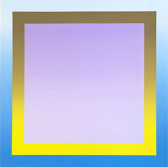
"Navona" BY Michael Boyd, 1971. Acrylic on canvas, 78 x 78 inches. Courtesy of Eric Firestone Gallery.
.
_______________________________
BASIC FACTS: "Michael Boyd: That’s How the Light Gets In: 1970 – 1972" is on view from May 4 to June 17, 2017 at Eric Firestone Loft: 4 Great Jones, NYC, 10012. www.ericfirestonegallery.com.
________________________________
Copyright 2017 Hamptons Art Hub LLC. All rights reserved.

An amazingly insightful review on work I might have passed by as no more than a well executed exercise in color theory. The observations as regards the studies are of particular interest. I have long found such insights to the creative process fascinating and edifying.
…and now I need to hunt down a copy of Alber’s ‘Interaction of Color’ to accompany Itten’s ‘The Art of Color’ in my art resource library.
Nothing beats the Albers book, but on that shelf you might consider adding:
Color and Culture, by John Gage
Concerning the Spiritual in Art by Wassily Kandinsky (he and Johannes Itten along with Albers taught wildly different theories of color at the Bauhaus – the poor students must have been wonderfully confused)
Can you imagine? I will certainly take a look at the Gage book as well. Thank you for the reference.
A fluorescent version of Frank Stella! Love the glow of each painting. Thanks for the article that helps me understand the artist’s work. Most appreciated.