It’s not often that a writer faces the curse (or, for some, the opportunity) of having to draw on the literal meaning of a one-time aphorism that has become at best a platitude and at worst a cliché. But in reviewing the exhibition currently on view at the Sarah Nightingale Gallery in Water Mill, there’s just no way around it: the handwriting is on the wall.
The loss of handwriting and the pluri-form communication contained within its graphic beauty is hardly a new development to decry, but rather one underway since 1439 when Johannes Gutenberg arranged loose alphabet letters under an agricultural screw press and invented “moveable type.”
Said machine replaced lush hand-written books and illuminated manuscripts— the only kind then—that conveyed the author’s emotions by cursive and flourish, resulting in a more sterile document that only partially imparted what the author desired. Whether the writing was about beauty, anger or despair, all emotions would now appear physically the same. It’s worth noting that Gutenberg’s screw press was invented by the Romans in order to flatten olives and grapes. And flatten it did.
The spread of knowledge and formation of the middle class via education through inexpensive books is generally agreed to have begun with Gutenberg’s moveable type. Prior to that books were simply too expensive and rare. Longhand cursive disappeared as a method of public communication but expanded as a method of private communication with the spread of literacy and later the invention of the post office. Moveable type for the public sector, and emotive cursive for the private sector: it seemed a clear way to divide the two.
This division would last a long time but has ended with the rapid adoption of email and texting during the past 20 years; both could be with script, but for speed and spelling the keyboard became the norm. The Common Core State Standards adopted recently as a standardization of grade school achievement among the states omitted the cursive writing requirement, and some states have dropped handwriting all together. The public and the private sectors now have the same appearance.
Sara Nightingale Gallery has mounted an attractive show titled “In Stereo” in which two artists, Peter Sabbeth and Ross Watts, examine this loss by looking at books, handwriting, and paper works from a variety of angles. Fortunately it is not a didactic social studies show but rather an attractive monochromatic room of quiet zen-like contemplation.
A show favorite by Watts is a beautifully scripted wall writing entitled “Concerning a Gallery” that looks like it dropped out of the 17th century: his penmanship is remarkable, and flowing cursive in graphite is a compelling object of beauty. This was probably common in another time and underlines the recent loss of paper objects of inviting decoration.
.

"Concerning a Gallery" by Ross Watts. Graphite on paper, 30 x 44 inches (diptych).
.
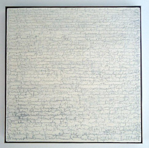
Sabbeth has pages and pages of gibberish scrawled in different styles covering the walls, one is not entirely sure it says anything or not and this viewer studied it at length looking for some recognizable words. In Bury Me Standing, a history of European Rom (gypsies), Isabel Fonseca noted that it was common among the clans to make up contracts with fake writing similar to what Sabbeth has here, wherein the presence of the writing was of sufficient solemnity to deem the document a contract.
.

"Dear John" by Peter Sabbeth. Acrylic and graphite on burlap, 30 x 30 inches.
.
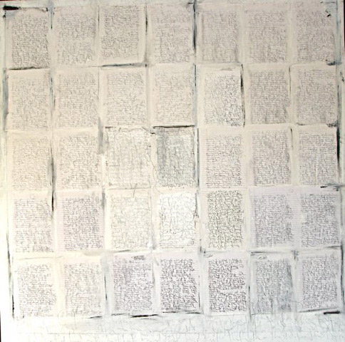
Such gibberish was a suburb of the deconstruction movement that swept through the art world in the ’80s, and other professions somewhat earlier, the obscurant impenetrable writing that was routine in this area was a deliberate attempt not to communicate anything, hence such was the communication. Sabbeth uses this to good effect in a number of pieces, often bringing to mind the graphic scribblings of Cy Twombly, among others.
.

"Rough Draft/ Final Version" by Peter Sabbeth. Mixed medium on linen, 60 x 60 inches.
.
Watts has several pieces about books on display that are often made from books, slices of books, a book enclosed in a cube, sliced pages pressed together on the wall by steel book ends. They contain a simple pleasure along the line of the minimalist On Kawara, who filled books with numbers and dates.
It's a handsome show and a rewarding experience to spend time with it.
BASIC FACTS: “In Stereo” remains on view through Dec. 8, 2013 at the Sara Nightingale Gallery, 688 Montauk Highway, Water Mill, NY 11976. www.saranightingale.com.
________________________________________
Copyright 2013 Hamptons Art Hub LLC. All rights reserved.
