Ever since Walter Benjamin wrote the essay, “The Work of Art in the Age of Mechanical Reproduction” (1936), the art of painting has been put on notice. Photography and film, Benjamin noted, usurped a number of the important social/aesthetic roles that had been played historically by painting and left it to languish or to become somehow repurposed.
More than 90 years later, we can't count the number of times painting has been declared dead, and yet, somehow, it persists.
Chuck Close, whose recent works are currently on view at Guild Hall in East Hampton, has always represented a kind of St. George to photography's dragon, as from the beginning of his career to the present day he has found ways to confront photography directly, using the painter’s toolbox to slay it. Indeed, what he has shown us, in example after example and medium after medium, is that even though photography has stolen aspects of painting's thunder, its very DNA comes from painting. This means, in turn, that painting—which contains the code to photography's structure—always has the ability to dissolve it.
.

"Cindy" by Chuck Close, 2013. Archival watercolor pigment print.
.
The Guild Hall exhibition, curated by Museum Director/Chief Curator Christina Mossaides Strassfield, encompasses the whole of Guild Hall's two main viewing galleries. Pieces made by Close between 1974 and 2010 start in the west gallery with the most recent ones, in the east gallery at the Museum, being his watercolor prints, felt hand stamped works on paper, and tapestries ranging from 2009 to 2013.
The show is unique to Guild Hall but various works in it have been exhibited at New York City's Pace Gallery, and many of the works on view are on loan from Pace. The works are accompanied by text panels that detail the subject, year, medium, and the exact dimensions.
Building Blocks
From the very beginning of his career, Close saw that representational images in painting were always built from two basic things, empiricism and method. He chose to use the camera to activate empiricism and the grid to activate method. And Close's image content was a perfect match for his process. What could be better than to depict the human face, which is the symbol of observation and the object and aim of the highest forms of representation? And of all faces, he chose (mostly) to depict the faces of artists, others who were dealing with the issues his work addresses. This iconography extends his total paradigm to a perfect edge.
Ancient mosaics offer some of the first examples of building an image with small autonomous fragments. By the Renaissance, subdividing an image with a grid had become painting's essential mapping technique. It was how all pictures were built, especially large frescos and mural-size works. In the 19th Century, Seurat and Signac took what had been discovered by science in optics by then and translated it to the art of visual depiction. Pointillism relied on the optical blending of painted dots of color to conjure the image. All these devices were precursors to the mechanics of the photographic image, made physical through even smaller dots printed in rows on paper.
In a sense, assessments of photography in the critical thinking of Benjamin and the critiques of Siegfried Kracauer forced visual artists of the modern era, if they were serious, to grapple with what role photography would play in fine art.
Now we are in the digital age, which allows a protean control over the dots, which are now smaller still, so small their very name, pixels, conjures a pixie-like, Tinker Bell fairy realm of magical alchemy where they yield images. Digitization is the quantum leap, but the basic idea, going back to the ancient mosaics, is the same: larger entities are made up of combinations of smaller ones, ad infinitum.
Close's genius is that he decided to deconstruct photography by painting, to work backwards as it were, from the present into the past. To think of it in a more confrontational way, he chose to paint the photographic image in order to repatriate it to painting. It was a stupendous idea. By imposing the grid over the photographic image to paint it, he produced a reverse alchemy. Doing so helped revivify painting's relevance, as it showed that painting could act as a commentary on photography.
Anyway, so much for painting being dead.
.

"Sienna" by Chuck Close, 2012. Archival watercolor pigment print.
.
Unlike many artists, it seems that Close got his philosophical issues clear very early in his career, which explains his almost unrivaled consistency as the work has progressed. Having solved that typically slow-to-develop area, what was left to explore (artists need some unknown, after all) were the choices of applications of media, support, surfaces and scale. These are the fields where Close has played, and there's an awful lot of play and diversity in his work as a result. A viewer just has to know where to look.
Close's earliest works in the show in the west gallery at Guild Hall,the two small ink and graphite drawings titled “Chuck Close, Self Portrait” 1975 and “Lisa P.” 1974, offer examples of his early approach. These drawings show the grid as a positive overlay, drawn through the rendering of the image. Allowing the grid to be a positive and visible element would seem to allude to the grid drawings of his peer, Sol Lewitt, whose influence was so pervasive for that generation. These two small works are wonderful examples of the beginnings.
.

Installation view with "Chuck Close, Self Portrait," 1975 on the left. Photo by Gary Mamay.
.
Close also works with the tradition of painting by using oils on canvas, still the preeminent way to make a lasting, two-dimensional image and object. The big black and white portrait, “Joel” 1993, and“Chuck Close, Self Portrait II” 2010 both demonstrate his later oil painting style, sometimes called the bubble technique, which he used to paint in the grids when a disability affected his manual coordination.
.

Installation view with "Joel" on the left and "Self Portrait II" in the center. Photo by Gary Mamay.
.
Close has had to deal with a number of physical challenges in his life, all of which impinge upon those capabilities normally associated with making art. These include face blindness (impaired facial recognition), dyslexia, and, since 1988, paralysis from the waist down. He has taken every challenge and turned it on itself, in the same way he took photography's challenge to painting and turned it on itself. That's just his character. By adopting this attitude and by his example, he has done a great service to those with similar challenges, while making others more aware of their prejudices with regards to disabilities.
Other works in the east gallery at Guild Hall show how Close has confronted the newest of media challenges, digital printing, which has since its inception revolutionized the art world. His archival watercolor pigment prints—large portraits of “Cindy” 2012, “Kiki” 2012, “Cecily” 2012, and “Zhang I” 2012—are among the most sumptuous of his works I have ever seen.
.
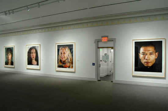
Installation view with "Cecily," "Kiki," "Cindy," and "Zhang II." Photo by Gary Mamay.
.
Playing with the techniques of watercolor, in which tonalities are made when light penetrates the medium and then reflects back to the eye, carrying with it the color and tone the medium has bestowed, Close brings to bear in these absolutely gorgeous works all the associations a viewer might have about watercolors. There are echoes here of Cezanne, Turner, Homer and Klee.
Through the computer, he is able to assign tinted values in each square of the grid and, I suspect, to print these "washes" in layers, through multiple passes, to arrive at the tones he wants. Through this technology, he achieves the same effects earlier artists developed manually, with a brush.
The use of the digital domain to reinvent watercolor is the kind of thing many in the art world hoped for when the digital revolution started, but there have been too few examples of this kind of innovation. These works certainly change all that. I suspect an entirely new genre of watercolor painting will be derived from them. They are that important.
Notice the size of the grid, too, as its variation determines the kind of focus the viewer experiences of the image. In “Cindy” 2012 , the grid size is about one and half inches, so the abstraction of the work dominates until the viewer moves back quite a distance from the surface. “Cecily” 2012 has an even larger grid of about two inches, so the "immediate splendor" (Alfonso Ossorio's wonderful phrase) is what the viewer gets from its abstraction until moving to the opposite side of the gallery. Then the representation finally comes into focus. In “Kiki” 2012 and “Zhang 1” 2012, the grid is smaller, about three quarters of an inch. In these two, the images are tighter and the focus moves closer to the surface of the work.
This choice of grid size is another one of those areas that Close plays with, and it begs, along with the beauty of the watercolor tints, the kind of contemplation that keeps one involved in the work.
Another method that Close has employed recently is the Felt Hand Stamp. These smaller works, done on paper, use oil paint as the medium. They look a bit like embroidery, as the texture of the stamping builds the surface out in the kind of tactile way that’s often seen in fabric art. “Kara” 2012 is a good example, and notice that rather than white, the base paper is tinted lightly toward the green spectrum and thus changes the entire register the colors play in. This is yet another way Close experiments within the strict program he has defined.
.

"Kara" by Chuck Close, 2012. Felt Hand Stamp.
.
The concept of weaving, so integral to painting's existence through the use of canvas for more than 700 years, is brought to the forethrough Close's most challenging works in the show, the jacquard tapestries. The warp and weft of tapestry offer a readymade grid on this support material. Recognizing this, Close chose to superimpose the photographic image on the tapestry by printing it, thus inverting his process. He applies the image to a grid rather than the grid to an image. Here again is more play.
.

Installation view with "Lucas" third from the left. Photo by Gary Mamay.
.
These portraits are first captured in the micro format of daguerreotype and seem to come forward through time as they are enlarged digitally to the huge heads the viewer sees, measuring close to seven by six feet. My favorite of these large tapestries is “Lucas” 2011. The head of this iconoclastic artist (Lucas Samaras) completely fills the entire frame. The contrast of the hot white lights shining from the back through his white hair to the deep matte blacks of the surrounding background provides a spectrum that encompasses the fullest possible range, rendering these two extremes at their brightest and darkest best.
If you haven't seen this show, don't miss it.
________________________________________
BASIC FACTS: "Chuck Close: Recent Works" remains on view through Oct. 14, 2013. Guild Hall is located at 158 Main Street East Hampton, NY 11937. www.guildhall.org
A trifold exhibition brochure features an essay written by Robert Storr, Dean of the School of Art at Yale University. Storr has served as Curator of the Department of Painting and Sculpture at MoMA, among other posts, and has written extensively on Chuck Close.
RELATED: "Chuck Close Opens with the Guild Hall Summer Gala"
________________________________________
© 2013 Hamptons Art Hub LLC. All rights reserved.
Mike, Always enjoy reading the way you express what you are seeing. It is a thorough walk through of Chuck Close’s artistic travels. It always irks me hearing that Art is dead, everything has been done! Art, Painting, Sculpture whatever the form taken is much like a fingerprint some present and some yet to be born. Thank You for your thoughts.
What a terrific review! Truly a pleasure to read. Going to excerpt and re-blog on Magnolia Editions’ blog. Thank you for such a well-considered essay.
The one minor correction I would offer is that the tapestries are not “printed” at all — the imagery is created entirely from the matrix of warp and weft threads.
Again, thank you!